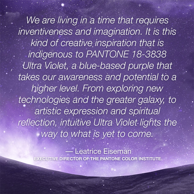
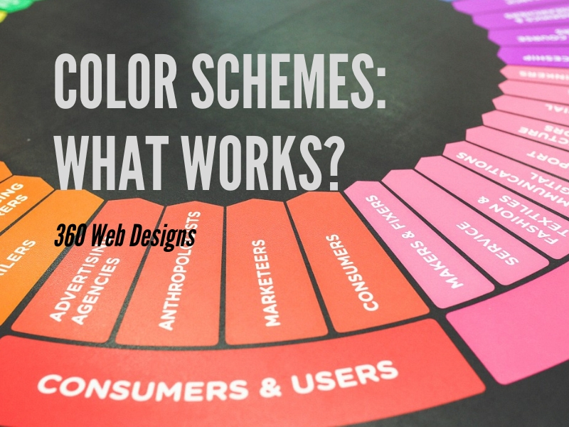
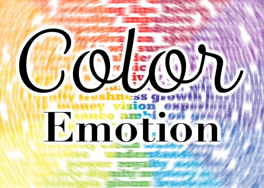
Because color is one of the main elements in company branding, the designers at 360 WEB DESIGNS pay a lot of attention to what is trending and why. Pantone chooses a yearly color that is not only trending, it is a color chosen for emotional response as well. Ultra Violet is a beautiful deep rich color that carries a lot of power. Read the Quote from Lee Eiseman below:
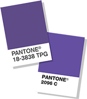 Announcing PANTONE 18-3838 Ultra Violet, PANTONE® Color of the Year 2018.
A dramatically provocative and thoughtful purple shade, PANTONE 18-3838 Ultra Violet communicates originality, ingenuity, and visionary thinking that points us toward the future.
Color of the Year 2018 – Quote from Lee Eiseman
“Complex and contemplative, Ultra Violet suggests the mysteries of the cosmos, the intrigue of what lies ahead, and the discoveries beyond where we are now. The vast and limitless night sky is symbolic of what is possible and continues to inspire the desire to pursue a world beyond our own.
Enigmatic purples have also long been symbolic of counterculture, unconventionality, and artistic brilliance. Musical icons Prince, David Bowie, and Jimi Hendrix brought shades of Ultra Violet to the forefront of western pop culture as personal expressions of individuality. Nuanced and full of emotion, the depth of PANTONE 18-3838 Ultra Violet symbolizes experimentation and non-conformity, spurring individuals to imagine their unique mark on the world, and push boundaries through creative outlets.
Historically, there has been a mystical or spiritual quality attached to Ultra Violet. The color is often associated with mindfulness practices, which offer a higher ground to those seeking refuge from today’s over-stimulated world. The use of purple-toned lighting in meditation spaces and other gathering places energizes the communities that gather there and inspire connection.”
(source: https://www.pantone.com/color-of-the-year-2018)
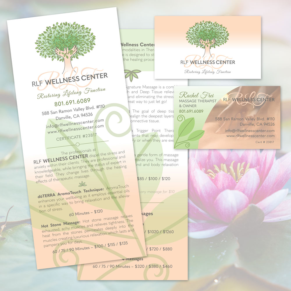
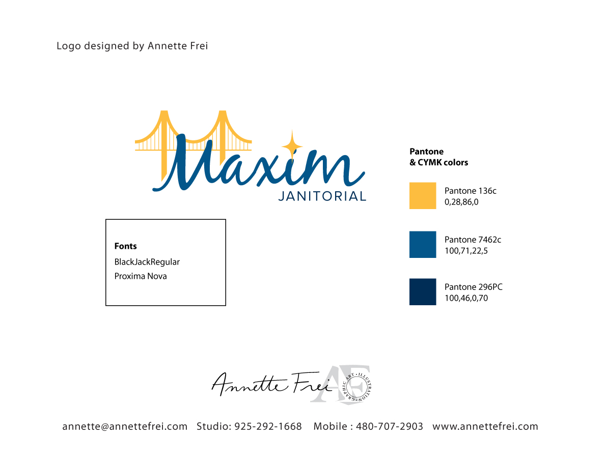
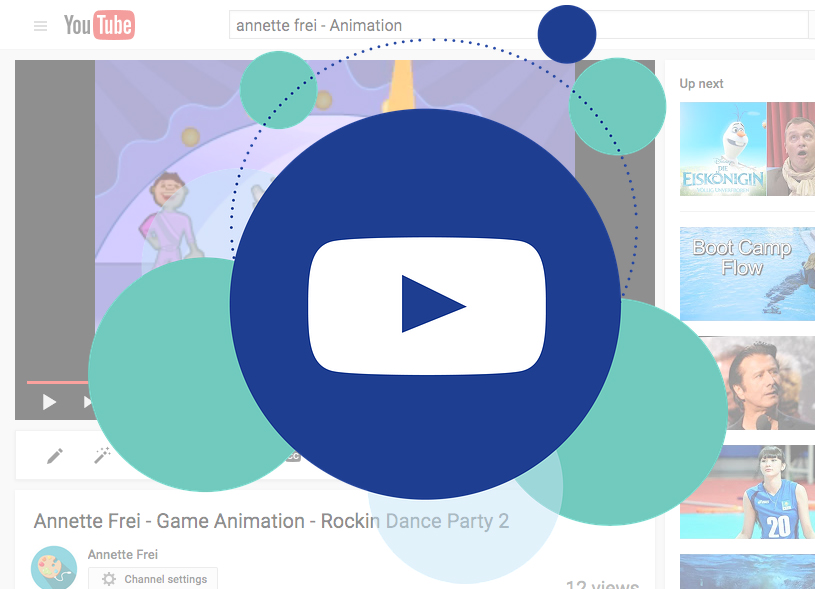
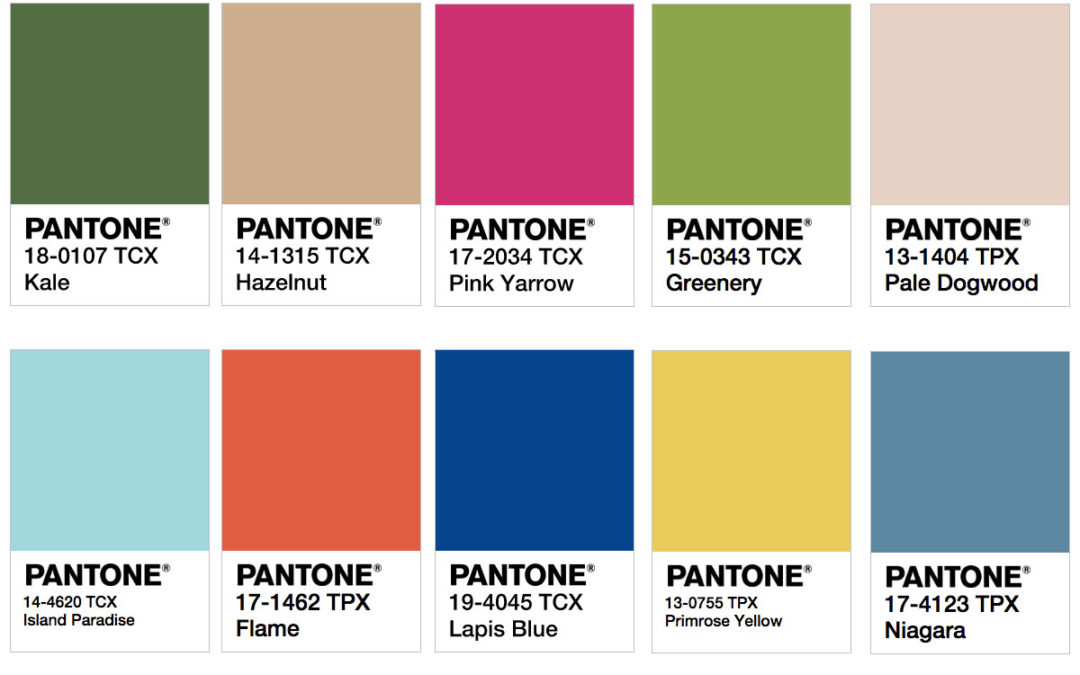
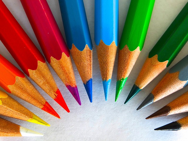
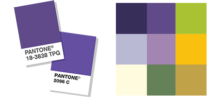
Here is a sample of a palette by Annette Frei using this color. For a logo, it would be wise to pick no more that 3 colors from the group below. For a website and other branding, all of the palette colors could be utilized. After choosing the logo colors, our designers often choose an opposing color on the color wheel for buttons and call to actions that should stand out on the site and in marketing materials. With this palette, the bright green or gold would be a good highlight color.
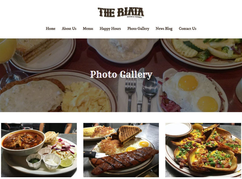
360 WEB DESIGNS and Annette Frei Graphics has over 15 years experience in web design and graphics. Put your brand in caring hands.