Presentation of content on your site should be easy to see
The text on your website indicates much of the important information you want your users to see. From your about page to your business hours or email, make sure that your site is easily readable.
Interactive vs. Non-interactive text
This includes buttons and text that have clickable links. Make sure to have a specific color for interactive text that identifies them differently from non-interactive text. Make sure the colors let the user know the item is clickable, and if the item has been clicked on previously.
Use some caution when having red text. Usually red is the color best used to grab someone’s attention, but it isn’t so in this case. Many people who are colorblind do not distinguish red as brightly – it may come off as blue or dark green. Some colorblind users see red as black color, so make sure to avoid using red text on black backgrounds.
If using a color on a text that isn’t black, try making the characters as large and bold as reasonably possible. This helps for those who don’t see color the same way as someone else. The color may not be identified, but the user will notice that a certain text may be larger or more emphasized, which will help catch their attention.
Reading between the lines
Make sure the spacing between your words is large enough. But not so far apart that people lose what the previous lines were meant to connect to. The smaller the font, the more spacing it requires.
Try to limit the number of words per line to around 80 characters. If the line of text is too long, it can confuse people when reading on a screen.
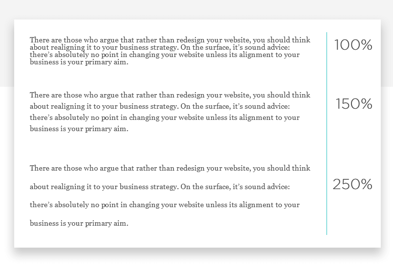
Some users with screen readers allow them to resize text up to 400%, make sure that your paragraphs and words don’t drop from the screen at this size.
Any audio or video file displayed on your website should include a transcript log of the file. Some of the visually impaired use screen readers to aid their vision. Others may use assistive listening devices(ALDs) to play back the text on a screen through text-to-speech. Having transcripts is also great for SEO, as Google crawl bots rank more accessible sites higher on the ladder.
This also means that your site should have the ability to turn off background audio for the user. This is to avoid the background noise from interfering with the reading as well as preventing it from being distracting. Its actually better to not have any background audio playing on your site at all, and make sure none of your videos are on autoplay either. Many people will skip on a website that auto-plays sound.
There is a lot of information available on how to make your sites accessible. Not only will this help prevent the loss of possible followers and customers, but it will also help your site rank better for SEO. Make sure all your text is legible and properly formatted for your users, both visually and audio-wise.