Fill out our form, and we'll connect with you within 1 to 2 business days.
Phone: (925) 989-7737

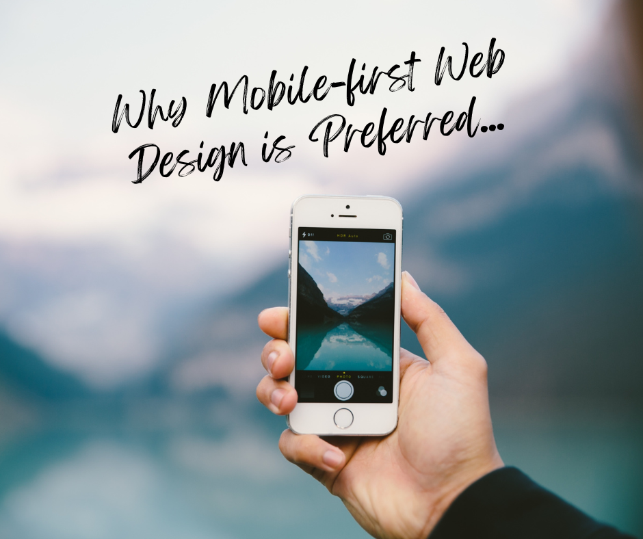
You may have heard of “mobile-friendly” websites, which sounds like “mobile-first”, but it is actually quite different.
Mobile-friendly sites are built for large screens and desktop users. The design starts big and then sized down.
The Mobile-First approach focuses more on the user’s needs that are simple and functional. The designs start for the smallest screen first and gradually work up to the larger screens.
When a web page has optimized content and fewer elements and widgets it will load faster and increase your SEO (Search Engine Optimization). Most mobile users search through Google and Google crawls and indexes pages using a mobile-first approach. In other words, Google is more likely to rank you higher on SERP (Search Engine Results Page) if you have a mobile-first design.
Internet users expect to have intuitive access to information on your mobile site. A consistent and simple navigation interface that is easy to locate as you are scrolling is imperative. According to Microsoft, the average attention span dropped from 12 to 8 seconds for web users. Time is of the essence. Intuitive navigation is important when it comes to creating a neat and clean user experience. Navigation drawers (Hamburger menus) are great to help users find information quickly.
A mobile-first design keeps bounce rates healthy due to the speed and ease of the site. It provides a better user experience overall and has a higher return rate as well.
It is always important to test our websites on different mobile devices and sizes before and after launching. But testing it regularly and on a wide range of screen sizes, resolutions, and view ports is made simple now. You can get all the different options in the LT browser. The LT browser allows you to see all the resolutions on an iPhone, iPad, Samsung, and MacBook.
Mobile traffic is continually increasing and more than 50% of consumers purchase products from their mobile device. The Mobile-first design gives your users the best experience possible, and Google will reward you for that!


