Fill out our form, and we'll connect with you within 1 to 2 business days.
Phone: (925) 989-7737

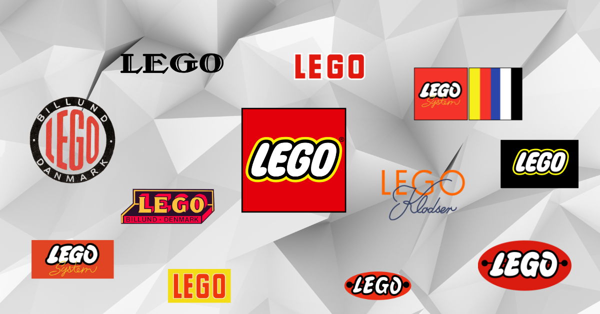
Last weekend, I went to the San Francisco Shopping Centre on Market St to do some pre-holiday season shopping. When I came across LEGO’s storefront window and saw a banner that was roughly 7×7 ft, I stopped in my tracks. This storefront display showed a visual evolution of the lego brand from its inception in 1934 to the present day. It was able to take me out of my holiday shopping zone, and caught my attention because of the history and stayed with me long after returning home.
This article lays out the evolution of the LEGO logo. In doing so, we hope to encourage you to introduce a little bit of the history behind your business with your followers and customers as a way to build authentic connections and strenghthen customer loyalty.
The iconic LEGO logo is recognized by millions worldwide, evoking recollections of childhood ingenuity and boundless possibilities. Over the years, this simple yet powerful symbol has undergone many transformations, reflecting the growth and evolution of the LEGO brand. Join me on a short journey through time to explore the fascinating progression.
In 1932, Ole Kirk Kristiansen, a Danish carpenter, launched a small business. His motivators were his four children, whom he struggled to support due to the dearth of carpentry jobs. As a result, Kristiansen began making wooden toys to keep busy with his craft and to ensure his kids had toys to play with. Over time, word spread of the carpenter’s exceptional craftsmanship around the Danish village of Billund, and Ole Kirk Kristiansen began selling them.
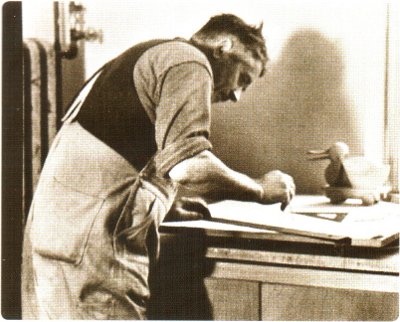
Ole Kirk Kristiansen, early 1930s
Two years later, Kristiansen sought after a suitable company name by organizing a friendly competition among his employees. Kristiansen emerged as the competition winner. The budding toy giant was dubbed “LEGO” — an abbreviation from the Danish expression “leg godt,” which translates to “play well.”
The decision-makers implemented the initial brand logo on postal communications, shipping tags, and other printed marketing materials. The second logo, appearing in 1936, served as an ink stamp solely for the company’s wooden toy products.
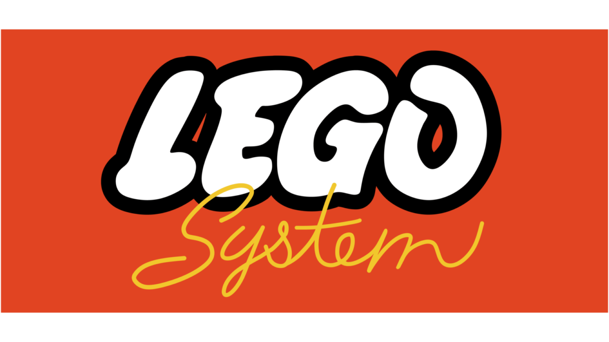
Country miles away from the playful emblem we’re familiar with today, the logos featured a simple black-and-white color scheme and a classy serif typeface, reflecting the modest beginnings of a toy company that would later revolutionize the industry.
1934, first LEGO emblem
1936, ink stamp
To add the illusion of depth, the text-based logo saw a development in 1939. The redesign’s third dimension marks the company’s transition from a small firm to a steadfast and growing company. The first color palette was introduced this year, beginning to better evoke a joy-supplying toy company.
1949
1949, used only on wooden toys
The tail end of the 1940s is notably momentous for the LEGO company. Ole Kirk Kristiansen decided to invest in an injection molding machine in 1946. In 1949, the first LEGO brick came to market. A new version of the company logo emerged in various advertisements and colors.
1950
1952-1953
1953-1955
1954’s edition below is where we begin to see a direct correlation to the brand’s playful and childlike identity, which is well-known today. The stark difference in letter shape and thickness compared to the year prior illustrates why it is important while engaging in the branding process to think about the qualities you hope to come to mind when your customers see your logo, and to communicate those specific qualities to your designer. What qualities makes sense for your company’s history?
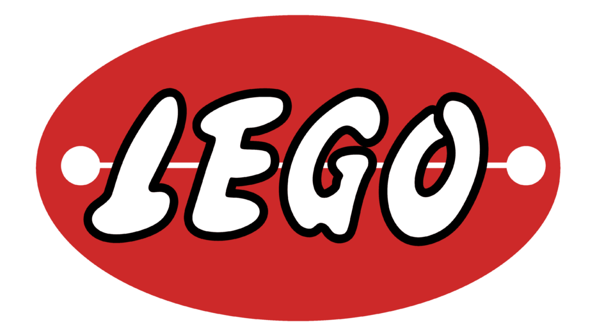
1953-1954
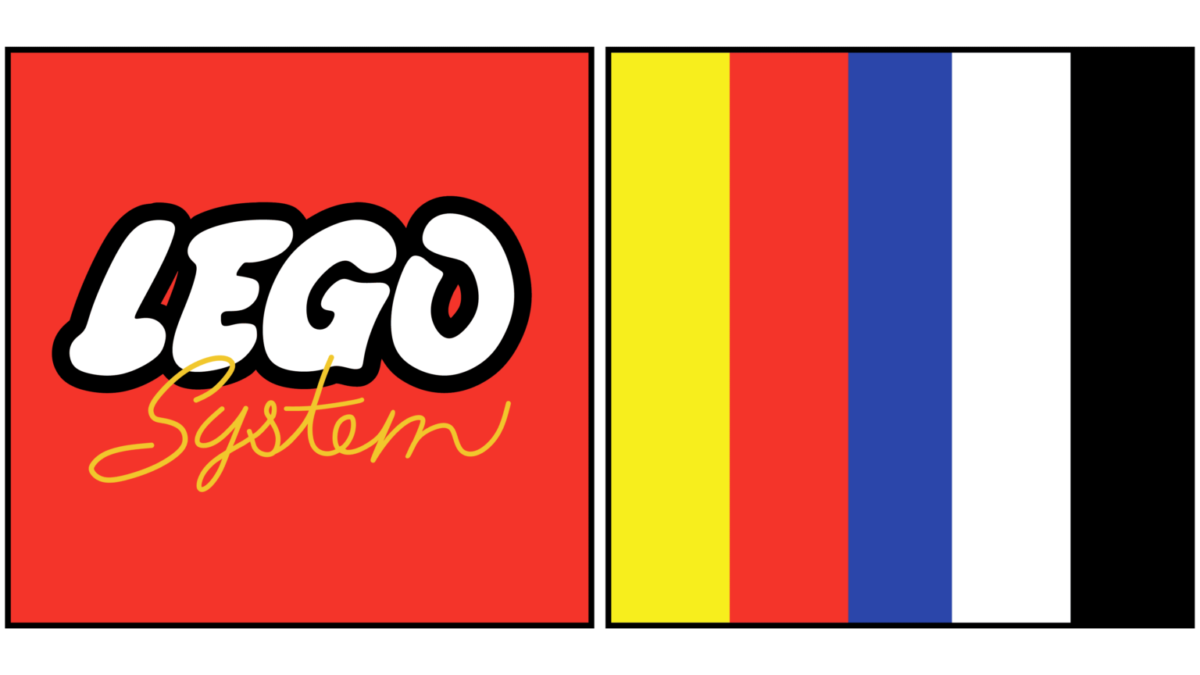
The familiar rectangle enclosure and red, white, and yellow palette were introduced in 1960.
1960-1964
1964-1972
In 1973, LEGO came to the States, undergoing an expansion and consolidation. The company’s creatives logically removed excess by switching out the rectangle for a square. Notice also a sprucing up of the letters and an increase in vibrant colors.
1973-1998
Finally, in 1998, the logo became what it is today. The change was small but necessary as businesses kept pace with the rise of digital technology. The letters were fine-tuned to enhance its digital copy, ensuring a consistent and recognizable brand presence across various mediums. This era highlighted LEGO’s ability to stay relevant and innovative in a rapidly changing world.
1998-Present
From its humble beginnings to its global dominance, the evolution of the LEGO logo mirrors the journey of a brand that has brought joy and creativity to generations of builders. The banner in the storefront window illustrates the power of introducing the history behind the details – the details, that is, that make up the business.