Fill out our form, and we'll connect with you within 1 to 2 business days.
Phone: (925) 989-7737

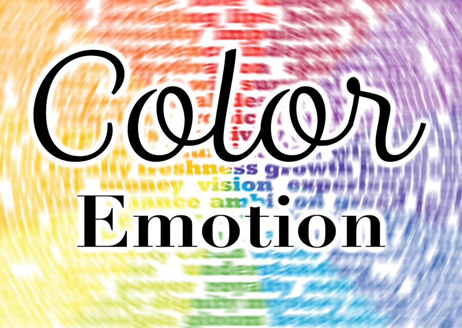
We all want to bring confidence to our customers. Color and a product’s emotional presence can help customers feel that your product is in line with the emotion it evokes. When building a business plan, or writing a mission statement, the look and feel should be on the top of your list. After all, first impressions are everything.
When we design a new logo here at 360 WEB DESIGNS, we start the process in black and white. This is because the color is such a strong emotional presence in the final design. It can overpower the shapes before it is time to put emotion into the icon or font. We make design shape decisions based upon the product and customer – rounded or geometric, thin lines or thick. Color choice is equally important. Some companies know right away what colors they want for their logo and website. Others need to be educated and dig deep into their mission statement to find the message they want to send.
comfort, healthy living, trustworthy…
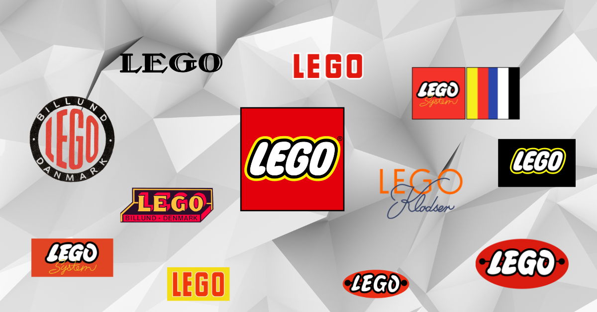
These are some words or phrases that color may evoke. Even before we realize what is happening, what we see makes us feel something. We may even make purchase decisions based on how companies colors make us feel. If we are looking for a dependable company that we can trust, the color blue in a logo may tell us just that. This is another part of branding identity that I talk so much about. The Logo Company has created a helpful visual guide of famous logos and their related emotions.

Credit: The Logo Company
Once you have a balanced logo that represents your company “emotion”, it is time to extend the brand identity. If you have a yellow logo, you may think that you should have a yellow website. Website colors should not compete with your logo but compliment it. So strong use of yellow in your site may turn off users in most situations. Use colors that bring attention to the logo, and pay homage to the product you are selling. Yellow makes a great highlight color for buttons and subheader text. Complimentary colors, such as blue and gray work well with yellow, and can be used in your images, page layout design and text. Current trends lean toward a minimalist view, which translates to simplicity in design; flat logos, minimal color palettes.