Fill out our form, and we'll connect with you within 1 to 2 business days.
Phone: (925) 989-7737

The brand identity of your company is what tells clients what is the “heart and soul” it’s built upon. This also includes the look of your website and the elements that it needs to make it great. No matter if you are a big company or if you are small there is potential for all. As a matter of fact, owning your small business status will set you apart from the big companies and help create a community where you are established.
Trends are out there and available to all who need it. There are several designs that can be used to get your vision out. It’s important that your website has a concise them throughout all the pages and is easy to navigate. Here are the things to look out for! For this year 2020 website trends,
– Imperfect animation that adds an effortless character
– Mixing photography with graphics`
– Solid frame with white space or solid color
– The dark mode gives a nice sleek and clean look
-3D elements to give extra dimension
Navigation should be easy to follow and to find. Usually, it’s a drop-down menu on the home page at the top left of right. There you should be able to find all the pages that you have available with any subpages. It doesn’t need to be any fancy it can be laid out across the top of the home page on a bar or it can be in what we call a “hamburger” which is the three stacked lines the drop-down with options.
![]()

Images are what ties the site together and give your viewers insight. Pictures can be one of the best ways to communicate a send a message. They show and not tell. Make sure that the images are clear and of good quality. There are resources that can give you great images for free. Keep in mind that images for all websites shouldn’t go over 1000 pixels it will slow the website down. This also brings us to have a project gallery that showcases all your work and services. Visuals are what makes it come together.
Free resource: https://pixabay.com/
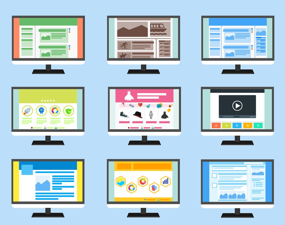
The look should be clean and simple. Regardless of what your business is you don’t want a site that’s so busy that it isn’t pleasing to the eyes. This means that each page is neat, has clear images, text, and the forms (if you have any) are visible. Everything has a place and is concise to your visitors. Remember that the wat the desktop site looks so will the mobile the only difference is that it’s made to fit the screen size.
Logos is what identifies and separates you from other companies. Having a quality logo that is clear and clean that embraces what your company is all about will help it stand out. This includes everything from shapes, color, typography, jingles, and so much more. Usually, your logo will be placed on the top left which makes it easy to find but it all depends on your design.
All of these are things to start thinking about. You can also look at other websites and web design social media pages for references and ideas. It’s always good to plan ahead which will make the process faster and understandable for both you and the team. Make a list of what you like and don’t like. Your website tells your story and connects you with people worldwide. It can be overwhelming but know that there is always a team to help you out.