Fill out our form, and we'll connect with you within 1 to 2 business days.
Phone: (925) 989-7737

What do you know about business cards? You do know that they are very important, right? Now, you may say, “Nah, my business doesn’t need business cards because I have a website.” For certain business owners that never bump into a live person, a website may be all that they need. But for the rest of us, the good ol’ business card handles a big part of our marketing. A business card is like the nose of the face of your business branding; the first judgement; the key to your portfolio. One day, I predict that our business card will be digitized, animated, and possibly an interactive website on a thin layer of plastic. Even in the age of technology, people are still going to want to meet people, and give them something as a reminder of what service we provide. It IS your business to know best practices for card design and printing. Here are some things to know about business card design and printing:

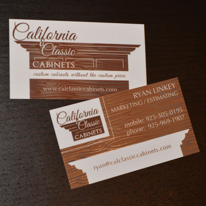
– Printing techniques, like Suede or Silk create a texture that is soft and feels more high end.
– Foils add eye catching shine.
– A thicker card, say 16pt are nice to hold.
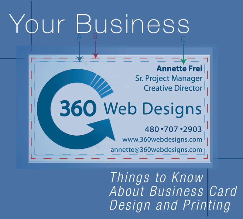
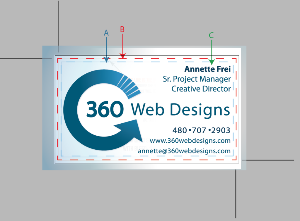
Bleed Areas: If you want color to go all the way to the edge of the card, you must continue the color beyond the trim area (B). This is called the “bleed”.
Readable Fonts: Using script, or cursive fonts may create a fancy look, but consider the readability of the lettering. A business card has a very particular purpose, which is to give specific information to the viewer. If there is ANY question as to what letter or number they are seeing, you may have lost a sale. Just one letter off on an email or URL means that you are not receiving the message.

Text Size: As a rule, pertinent information should be no smaller than 10pt text size. Depending on the font, even 10pt can be hard to read. If you have room without crowding, go as large as 12 pt. There is nothing more annoying than to be trying to put someone’s email in to your contact list using a magnifying glass.
Spacing: Keep all text (C) within 1/8 inch from the trim edge of your card (B), and within the “important information area” (A). Running the risk of having cards printed with part of the text getting cut off is just not worth it. Also, having text too close to the edge creates a crowded feeling. Use of Kerning* and Leading* type creates just the right amount of distance between characters and baseline. Designers are usually very careful when adjusting with these tools because kerning and leading defaults give the optimum spacing for that particular font. One reason to stretch out the kerning is if you MUST use 10pt or smaller. The text may be more readable with more space between each character when the text is small.
What to Include: Limit information you put on the card to name, position in the company, phones, email, website, Logo…If you are creating a two sided card, you have more real estate to play with. Still, keep it simple with lots of space around the logo.