Fill out our form, and we'll connect with you within 1 to 2 business days.
Phone: (925) 989-7737

In the past 10 years, Website design has progressed at an alarming rate. When smartphones were first hitting the market, there was no desire to make “mobile-friendly” websites. It was difficult and still needed time to experiment. More people have gotten used to using smartphones, so it has been increasingly important to create functional and responsive websites for mobile. Let’s talk about some of the trends and concepts that are being applied to new, trending sites.
Smartphone web development has only gotten better and easier! People use their phones to browse the internet more than ever before. Website developers have adjusted focusing their websites on UX (User-Experience). UX is how people will perceive your business. It also creates a lasting first impression. It’s important for the website to have simple functionality and fast access to information. Buttons should be responsive. This means your website pages need to load quickly without eating up a phone’s data plan. Compressing pictures and resizing them will help. Busy people need information quickly. If they can’t get it in a reasonable time, they’ll move on to someone else. Hamburger menus are very popular and allow users to access content quickly and easily. They can also work well for desktop and tablet computer, making the user experience feel seamless across multiple devices.
Illustrations are a wonderful tool to implement and work well with any website. Simple graphics are best, accompanied with eye-catching colors. Illustrations are great for producing an abstract concept that cannot be expressed in words. An illustration can symbolize or invoke a feeling that a photo normally could not. Because of this, it can create a sense of ethos for your business. Color schemes are important when creating illustrations because they directly invoke a certain feeling to the user. Cooler, calming colors can bring a sense of warmth and familiarity to your website, while bright colors can create excitement. Consider color schemes carefully depending on your business. Take a look at an older blog for more information on the subject.
Page transitions have been taking center stage in web design. As you scroll down a page, the transitions help you know you have arrived at a different section of the page. This can be used to highlight new information in a beautiful and breathtaking way. It can be as simple as icons fading into view as you scroll, or rolling into position from left to right. Animations make your page come alive and stand out from other sites. However, keep in mind that you don’t want your animations to be too distracting. The page should feel alive, but not be an overwhelming experience. Floating navigation menus is also a great tool to implement. They allow for access the menu while you have scrolled down the page. It keeps the menu ready for easy access.
For the past few years, minimalist design normally has been the standard. It works best with most business website design because it has a clean and professional look. Minimalist webpages mean that they are set up with UX in mind. Minimalist websites tend to look more like a newspaper, with colors that are easy on the eyes. This focuses the user on the content, not eye-grabbing graphics. Some page transitions can be implemented, but not overdone. Grid formats are popular with these designs, as they allow fast access to information in a preview-like view of each page.
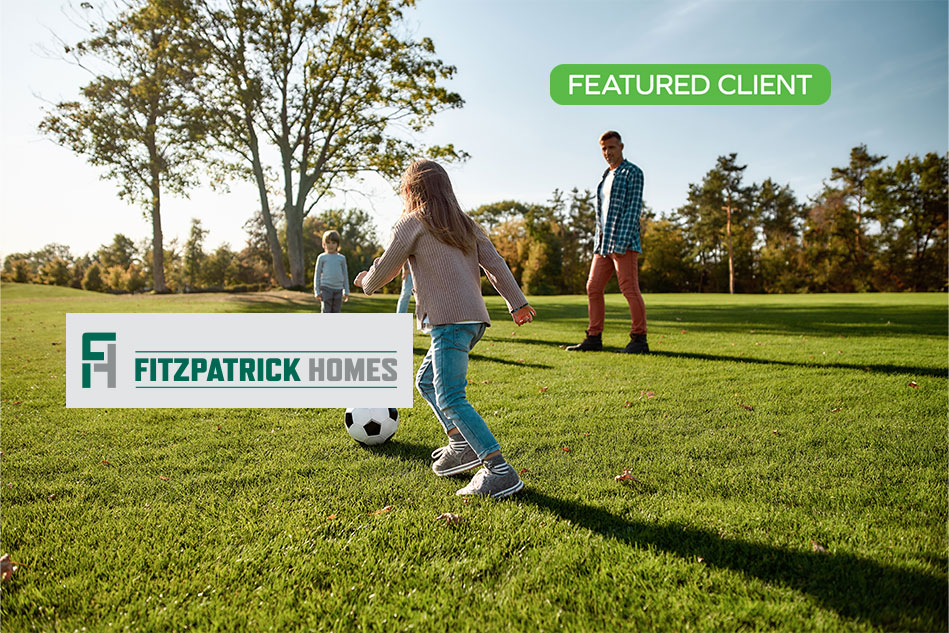
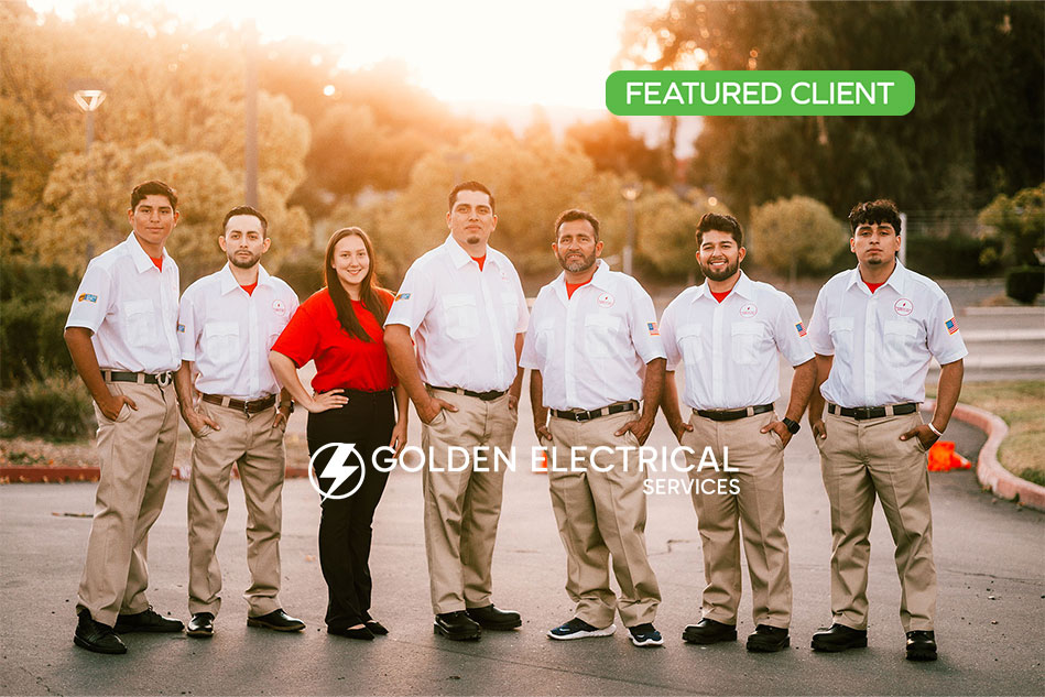
Hopefully, this gives you an idea of what to look for in building a website, and what might work for your business. There are many other routes and different techniques that you can try, so I urge you to go explore the web and see what inspires you! 360 Web Designs wishes you a very Happy Holidays and Happy New Year! Let’s get designing!


