Fill out our form, and we'll connect with you within 1 to 2 business days.
Phone: (925) 989-7737

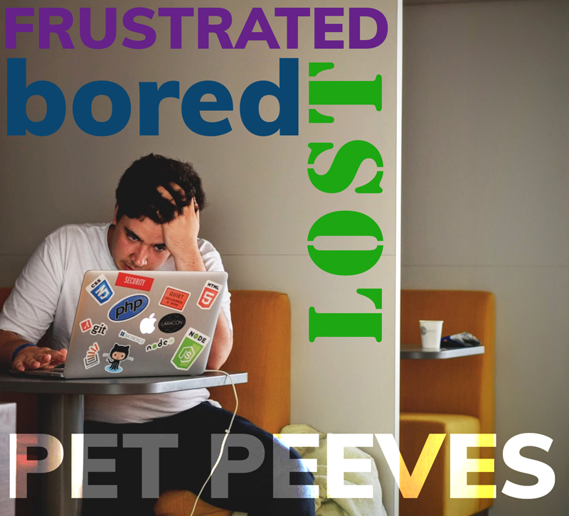
In last weeks blog, “What is the Atmosphere of Your Website?”, Brenna got us all thinking about what feelings, judgements, and assumptions comes up when looking at websites. Frustration and boredom will lead customers away. With a small survey, we asked some shoppers and business owners to tell us what would make them leave a site.
“The ads that pop up.” – Gini Graham Scott
“I don’t like when the home page it not user-friendly/well labeled/organized.” – Brigitte Black
“I don’t like slow websites.”-Dorene Gomez
“Webpages where I really have to scroll around and hunt down general info like business hours, contact info, pricing, etc.” – Melissa Ko
“Out of focus or dark pictures.” – Nicole Gee
“Web pages that are difficult to navigate or take a long time to load.” -Tracy Elliott Pisenti
“Totally unrelated pop ups.” – Dan Diedrickson
“Websites with no video ;)” – Maria Bright Cooper
This survey shows that ads are annoying. Use them sparingly, and only in appropriate situations. Customers dislike ads that pop up in front of information that they want to see. Viewers want to see the contact information easy to see as soon as the website opens, so we recommend having your phone and address in the header. Ease of navigation will get the customer what they want when they want it. Keep buttons simple and in plain site. Unless the site is a Designer site, it may be smart to keep the layout similar to what is tried and true. Video and photography grab the eye and give a lasting first impression. Spend time and $$ on the visuals for a good ROI.
All this, along with a professional current design from 360WD, will make your company’s website attractive and professional.