Fill out our form, and we'll connect with you within 1 to 2 business days.
Phone: (925) 989-7737

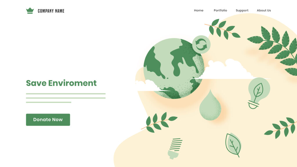
Small business landing pages are designed to guide website visitors toward a specific action, whether it be to sign up for a newsletter, make a purchase, or book a free consultation. They have great value for small businesses looking to target local audiences.
“The idea is to funnel some of your traffic to a specific page” (Entrepreneur, 2022). Landing pages are usually separate from your core website. This makes it an ideal platform to speak to specific audiences with your content, images, and videos.
The competition is fierce for small businesses trying to gain visibility and hold website visitors’ attention long enough to convert them. Here are nine best practices to keep in mind if you’re thinking of adding a landing page to your website, or are looking to improve your landing page conversions.
Your headline is the first thing visitors will notice when they visit your page. Therefore, it should be clear, concise, and persuasive. It should communicate your product or service’s main value proposition or benefit. Aim for clarity over cleverness.
Without over-explaining, you should have a subhead for every paragraph on your landing page that explains what the section will entail. You can also exercise this approach when introducing your visual content, such as images, on your landing page. These subheads should aid website visitors in quickly scanning your website’s content; as we know, being as efficient as possible is significant to most Internet users today.
It is crucial to carefully pick your landing page’s hero image – a large, attention-grabbing picture with text typically shown in the above-the-fold area of the webpage, directly beneath the website header. Ensure the image is relevant and has a high resolution. Blurry hero images are an excellent way to turn off your prospects. Poor-quality images reflect poor-quality brands.
When looking for the perfect hero image, remember the offer your landing page communicates and the benefit it brings to interested visitors. Try to visualize what that may look like. For more on how to go about selecting images for your website, read our article, Choosing Good Images For Your Website.
Think of the key phrases your target audience might use in a search engine to come upon your offer or solution. An essential piece to designing a landing page is engaging in keyword research. For more on the different types of keywords and valuable keyword tools, please read our article, How To Start Keyword Research, published earlier this year.
Determine the natural action you want visitors to take and make it abundantly clear. Whether it’s “Sign Up for our Newsletter,” “Request a Free Consultation,” or “Call Now,” the CTA button should stand out.

In contrast to regular web pages of your website, such as your homepage, about page, and pricing page, landing pages should be free from unnecessary links or information. Since landing pages are designed for one goal – to convert visitors into customers or leads – avoid adding content that distracts from that goal or prompts the visitor to navigate away from the landing page.
When your landing page requests information from visitors, be careful not to make excessive requests. Only ask for the information you need. Typically, a name, contact method, and the type of service should suffice.
Offer something of worth to your visitors. This offer might be a discount, a valuable piece of content, or a free consultation. Put this promotion as high up on your landing page’s information hierarchy as possible. Users shouldn’t have to search for the value they are seeking.
Foster an environment of trust by displaying positive Yelp reviews, Facebook business page ratings, positive client testimonials, and the like. People want to know that other customers made the right decision in choosing your business for the product or service in question. By making your past successes and milestones readily accessible on your small landing page, prospects can trust your business more efficiently.
Responsive design ensures that a small business landing page displays correctly and is user-friendly across various devices and screen sizes. The layout, images, and other page elements automatically adapt and reposition themselves depending on the device being operated to view the site. Because over 55% of global website traffic comes from mobile phones – a trend that continues to grow steadily – there is a high probability that for whichever type of business you own, most of your visitors will access your landing pages through their mobile devices.
If your page isn’t mobile-friendly, it could negatively impact its position in search results, reducing visibility and organic traffic. Furthermore, websites that need to be optimized for mobile often have a high bounce rate (visitors leave the site after viewing just one page). That together likely means all your hard work writing enticing copy, creating focused CTAs, and choosing engaging photos will have gone to waste.
For small businesses navigating the digital marketplace, a robust landing page can act as both an intro and a handshake. It’s the fusion of clarity, aesthetics, functionality, and trustworthiness where landing pages find success. As trends and technology evolve, some practices may shift, but the core best practices remain:
360 Web Designs is here to give you the information you need to succeed in creating a good website! We build websites as well as offer ways to model your brand. Get in touch if you have any questions, or check out our other blog posts for more tips and tricks!