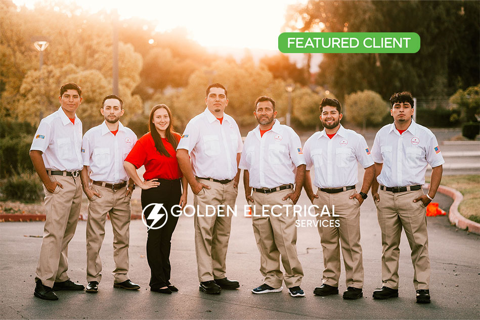
Fill out our form, and we'll connect with you within 1 to 2 business days.
Phone: (925) 989-7737


I took a poll from some friends of mine. The question was:
One of mine is the lack of a visible location on the home page. It is a bummer when I find just the business or product I am looking for, then find out it is in Florida.
Here is what they said, and a response from a web developers perspective.
Gini Graham Scott – “The ads that pop up.”
In the websites we design, there are usually no ads that pop-up automatically. We like users to make decisions as to when they want to fill out a form. Customers can get annoyed by images popping up while they are trying to look at other content.
Brigitte Black – “I don’t like when the home page it not user-friendly/well labeled/organized.”
Designers sometimes get a bit too creative with layout in hopes to win an award for new styles, but unless it is completely intuitive, a design that the user finds somewhat familiar is the best choice.
Dorene Gomez – “I don’t like slow websites….”
There are a number of factors that can slow down a website. 360WD encourages clients to keep photo sizes to a minimum unless they are the main home page attraction. Statistics show that potential customers will leave within 10 seconds or less if the site does not load, or pages are slow.
Melissa Ko – “Webpages where I really have to scroll around and hunt down general info like business hours, contact info, pricing, etc.”
Having a phone number and navigation right at the top of every page is crucial. Leading the user to the information they want is the best way to keep interest and make a sale.
Nicole Gee – “Out of focus or dark pictures”
Most of us are visual people. And first impressions are EVERYTHING. Invest in great images for your website and other marketing. Your business will have a more professional appearance, and it can help bring in the type of clients you want.
Tracy Elliott Pisenti – “Web pages that are difficult to navigate or take a long time to load.”
Clean, well thought out navigation is crucial. Too many buttons cause anxiety, and too few leave the user frustrated because they don’t see what they are looking for. We lay out the site map to see if it makes sense for the business and use drop-down menus for second tier pages. At 360 WEB DESIGNS, our designers also use home page features like a Services section and a Blog Feed for a more image loaded visual navigation.
Thank you to all my question participants this week. Send me your thoughts, and any questions or topics you’d like me to blog about.