Fill out our form, and we'll connect with you within 1 to 2 business days.
Phone: (925) 989-7737

Creating your website can be on the most fun things you will do but can also a little stressful. From picking a design, to colors, pictures and so much more, you want to make sure that your website is visually pleasing and easy to navigate. Here are some of the 2020 trends for websites.
In 2019 website tends we saw that being mobile friendly makes it easier to accesses and gives a better on the go experience, which is still true. Designs for minimalism with colors that are easy on the eyes were very popular. Now that we are transitioning into 2020 some things in graphics, color, and page designs have changed!
Color catches the eye quickly and it will definitely attract more time and attention to your website. That’s exactly what we want! To keep your viewers interested. The colors that you pick should not blind people or be so loud. Picking out a nice muted color pallet of vivid or pastels like coffee brown, rosy pinks, sun light yellows, sky and ocean blues, mosey greens, galaxy purples, will be trending in the New Year.
Colors like those will be great for a color gradient effect giving your graphic or text a fresh look. Of course you can also have dark colors as well or bright, it’s up to you! Remember to pick colors that go with your business ideas, service, and product. Color has a lot of meaning as well so it can also benefit you to look up what each color may represent. Also look into color trends in fashion, interior, or anything having to do with creativity to help you explore color pallets!
Another way to add some bubbly to your website is to have eye popping graphics and GIFs animation. Going for a more imaginative design to your logo and page lay outs will have more power than something simple. Be abstract and dreamy with shapes, colors, and textures. This also brings us to your font design and size. The font can be heavy in boldness and simple in the style of writing. It’s the background that will complement it and help it to standout. Your font doesn’t have to be flat either it can pop out through layering of color, shading, and movement.
Combining photography and graphics will also be a trend. So in this case, Photoshop will be your New Year’s Eve friend.
Having photography mixed in with colorful lines and shapes will give your photo a unique touch. How you design your website shows your clients how creative your business is and it shows that you stay on top of all the trends. GIFs are also a great graphic to have since there is movement and 3D visual. It’s something that’s gives amusement and anticipation to the viewer. Having a video for your clients to check out is also a good feature to offer. Great even, because some statistics found by Yuri Musienko in his MereHead blog says that 96% of users will explore product in deeper detail and 79% said it convinced clients to buy the product more. The designs that you choose to have to be completely out there. They can still be minimalistic designs that say you are here for the New Year and new creativity!

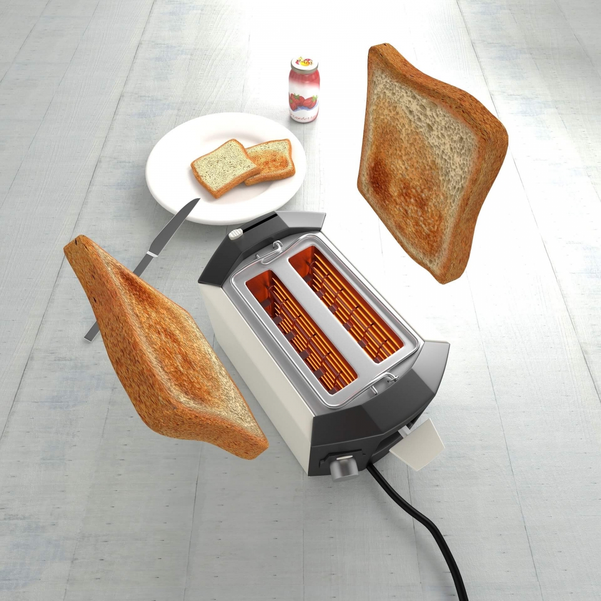
This image here is a great example of a 3D effect with lots of detail. It also looks yummy which is a plus.
The very first landing page is the first impression. This page has to be simple to navigate and self-explanatory as should all the others pages as well. Make sure that everything is visible and clickable like social media links, tabs, pictures, videos, buttons, and any other feature that you have on there. And don’t forget your logo, that’s very important. No matter what you have on your website it should be fast to load and be filled with good information.
There are many styles you can go for and each page must have the same effort as the landing page. Everything needs to look just as good, just as informative, and just as easy to steer. Keep everything organized and if there’s a place for your clients to comment and ask questions make sure to keep up with the responses. On your website you are bring your ideas alive and adding to the imagination of others.
Now that the New Year is approaching (basically it’s here with a new decade!) it’s time to get things going! Let’s make it the best with the right mind set and the enthusiasm for bad New Year jokes and puns.
Anyways, it’s time for us at 360 web designs to take a break. Especially since we haven’t showered since last year!
Happy New year and see you all soon.
Images from Pixabay