Fill out our form, and we'll connect with you within 1 to 2 business days.
Phone: (925) 989-7737

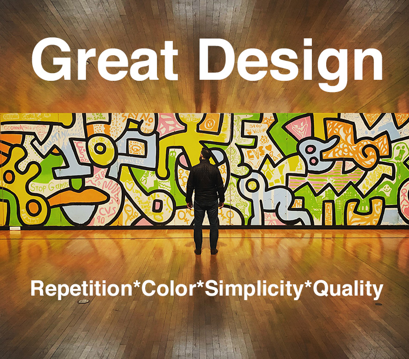
Good design repeats. It repeats throughout the website. Graphics can repeat in varying sizes, and opacity. Words and phrases repeat the main idea, which could enforce the company mission statement or core beliefs. Remember it takes seeing, or reading the same thing more than once can help people understand your message more clearly.
Color influences the mind subliminally. If you want to project sophistication and simplicity, gray, white and black may be good to use. Brown is synonymous with earthiness and durability. Orange exudes bright cheery energy. A thorough study of a businesses mission statement and culture helps designers pin down the best color combinations.
A page filled from edge to edge with multiple call-to-actions, clickable boxes, text and graphics, can make it hard to focus. Decide what the focal point of the page or section is, then keep it simple. The impact may be much higher on a page that has just one sentence and a graphic, as opposed to jamming the visual area with a barrage of competing elements.
High quality design and photography are known to elevate how the public perceives a company. While searching on the web, do you find sites that look like they have built the site themselves, or taken their own photographs? Does this EVER make you think “Wow, I want to buy from them. I appreciate this mediocre site.” ? NO. I didn’t think so. Using great design is always worth the initial development investment.
Want to look more closely at 360WD‘s design process? Check out Our Process and 360 Web Design Process blog.