Fill out our form, and we'll connect with you within 1 to 2 business days.
Phone: (925) 989-7737

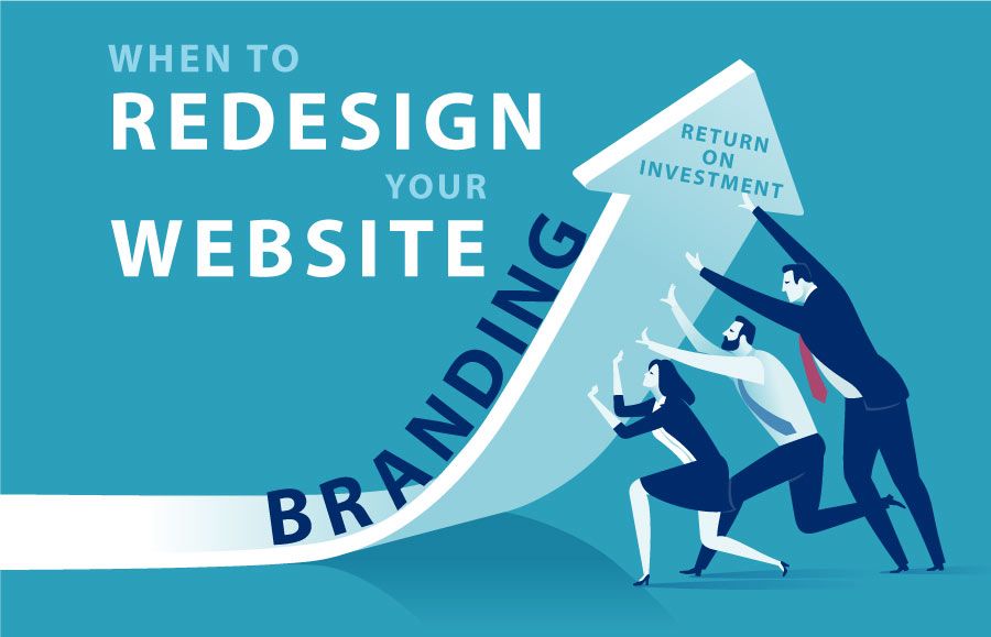
The world of website development is constantly evolving in design and functionality. It isn’t a matter of if you should redesign but rather when to redesign your website. Every year can bring new laws, and regulations are constantly changing. To keep your business on top of the latest best practices, as well as in compliance with regulatory standards, it’s important to budget for ongoing maintenance that will keep your performance level top-notch in the meantime. In this blog post, we talk about when to redesign your website and the warning signs to watch out for.
Over half of global website traffic comes from a mobile device. When your website is mobile-friendly it will change its layout based on the device being used. It allows for readable text, adequate space tap targets, and quick response time. In 2015, Google announced that its algorithm would rank mobile-friendly websites higher when it comes to configuring search results. This automatically puts you at an advantage in being found on search engines. Making sure your website is mobile-friendly ensures a better experience for potential businesses.
High bounce rates and low conversions are not a good thing. Websites are designed to engage the user to stay on the site and explore it. A bounce is when a person leaves your website after only visiting one page. They came, they saw, and they left.
A conversion is when someone comes to your site and explores it. They are engaged and might sign up for a newsletter or a contact request. A low conversation rate means they are not effectively being drawn into your website.
We have all been on slow websites and our patience for them is little to none. As quickly as we clicked onto their site, we will click out of it if it’s slow. Old websites can get bogged down with outdated code, old plugins, heavy graphics, and videos. This is a huge deal to search engines and consequently, if your site is to slow load, it won’t rank high overall. According to an SEO expert, Neil Patel, 47% of users expect a web page to load in under 2 seconds.
Regular maintenance can also help as far as making sure your plug-ins & WordPress are regularly updated. This keeps your website from crashing due to outdated software.
Think about your website like a store. An outdated website is like a store that looks shabby and dated. The paint has faded, and the curb appeal has lost its zeal. Your store may be functional on the inside, but first impressions are visual. If you pulled up to a store like that, chances are you won’t go in. The visual appearance of a company website is often associated with the quality of its brand and services. This is an area worth investing in and budgeting for.
I recommend visiting your competitors’ websites often to compare them to your own. Are they more functional? What looks clean and fresh about their sites? How is it more appealing than yours and why? What does the competitive landscape look like from a visual perspective?
At the beginning of this article, I talked about how regulatory standards and laws can change from year to year. This is a great example of that. The ADA requires that your website provides level A standard ADA compliance. Your designer can achieve this through a new plugin or widget. The alternative to this is a lawsuit waiting to happen. It’s a simple fix but without knowledge of the changing regulations, you could end up sued.
There are three plugins & widgets we recommend:
If your website is more than two years old you most likely need a website redesign. It can be a simple matter of changing content, colors, and graphics. Depending on how outdated your code and software are, you shouldn’t have to recreate your entire website. Our team here at 360 Web Designs is ready to help you with any design changes you need. Whether it’s a facelift to your website or a complete rebranding, we are excited to work with you to keep your site current and your “store” desirable to enter and stay awhile.